
In this six months-long contract with Learning Vessels, (LV) I also embarked on a rebranding project to help reframe and strengthen the identity and character of LV.
Rebranding LV
Ideation, Conceptualisation & Execution
Client Brief
LV wants to reposition itself as a more reliable & mature, yet fun brand. LV also wants to have its brand move in the direction of 'Vessel', 'Sea related stuff'. They noted that they had no intentions of changing their logo and primary colours.

Ideation
Before jumping into the graphics, I dissected what LV was all about. I tried to single out important keywords that align both with the brief and potential characteristics of LV.
Questions: What represents the brand? How would I describe LV in a sentence using the key words?
Mascots
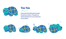
The client wanted their mascots to be super cute. Initially, I wanted to have the mascots made using the design elements from earlier. However, the client wanted a more generic kind of cute-look to the characters. So, these are the finalised versions.
I did up a short bio of the mascots to aid me in designing them too.


As I researched, I found that wavy lines and non-symmetrical shapes best suited the LV brand.
Gentle, wavy lines:
Humble, Gentle, Mohtherly, Caress.
Non-symmetrical shapes:
Natural, Down-to-Earth, Approachable.

Then, I created the most basic design elements that I thought could represent LV (The irregular shapes & wavy lines).
Design Elements
Firstly, I decided on the secondary colours to match primary colours, as well as to suit the 'feel' of LV (As mentioned above).
Colours
I tested how the elements could be used in illustrations.
Element Testing
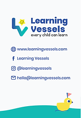
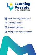
After deciding on the elements and type, I tried applying them onto bigger scale collaterals, like the site & name cards, etc.
Expanding into the Collaterals


Typeface
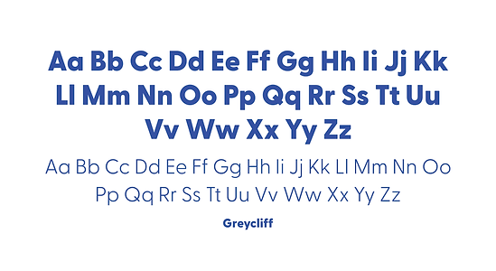

The client raised that they did not like their current font, Poppins, as it looked too cutesy.
They wanted a more versatile type that could be used across social media designs and more corporate areas such as letterheads.
I discussed the font selection with another designer, and we ended up choosing Greycliff as it had semi-rounded corners that checked-out all the criteria (Plus it had a huge family).
As for the secondary font, the client decided to go with Apricot.
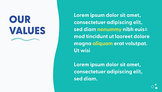
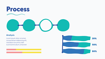
At this stage, my client also asked for slides, so I dished out a slide master (PowerPoint), for them to use as they are waiting for other collaterals to approve.


Icons
Before designing the icons, I did up an icon list so I wouldn't get sidetracked. Thes list is collated accordingly to the aspects of LV.